
“Ann, I loved your training, but I’m having trouble applying what I learned. Something’s off with my datasets, and the graphs are taking forever!”
This past year, I’ve spent more time teaching about data management than data visualization.
When I look under the hood of companies’ spreadsheets, I’ve noticed way too many data management issues that could be avoided altogether.
In this article, you’ll learn about a critical prerequisite for useful data visualization: contiguous datasets.
Here’s what I often see:
Separate datasets for each time period.
NOOOOOOOOOOOOOOOOO!!!!!!!!!!!!!!!!!!!!!!!!!!!!!!!!
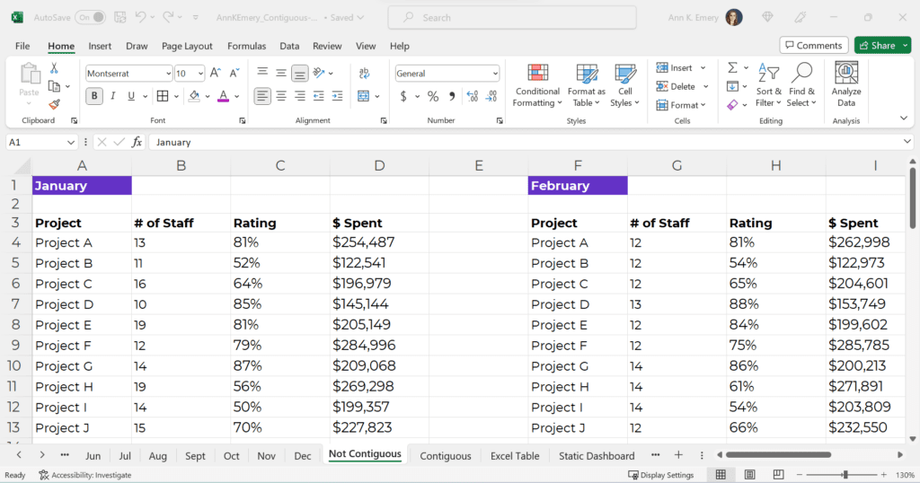
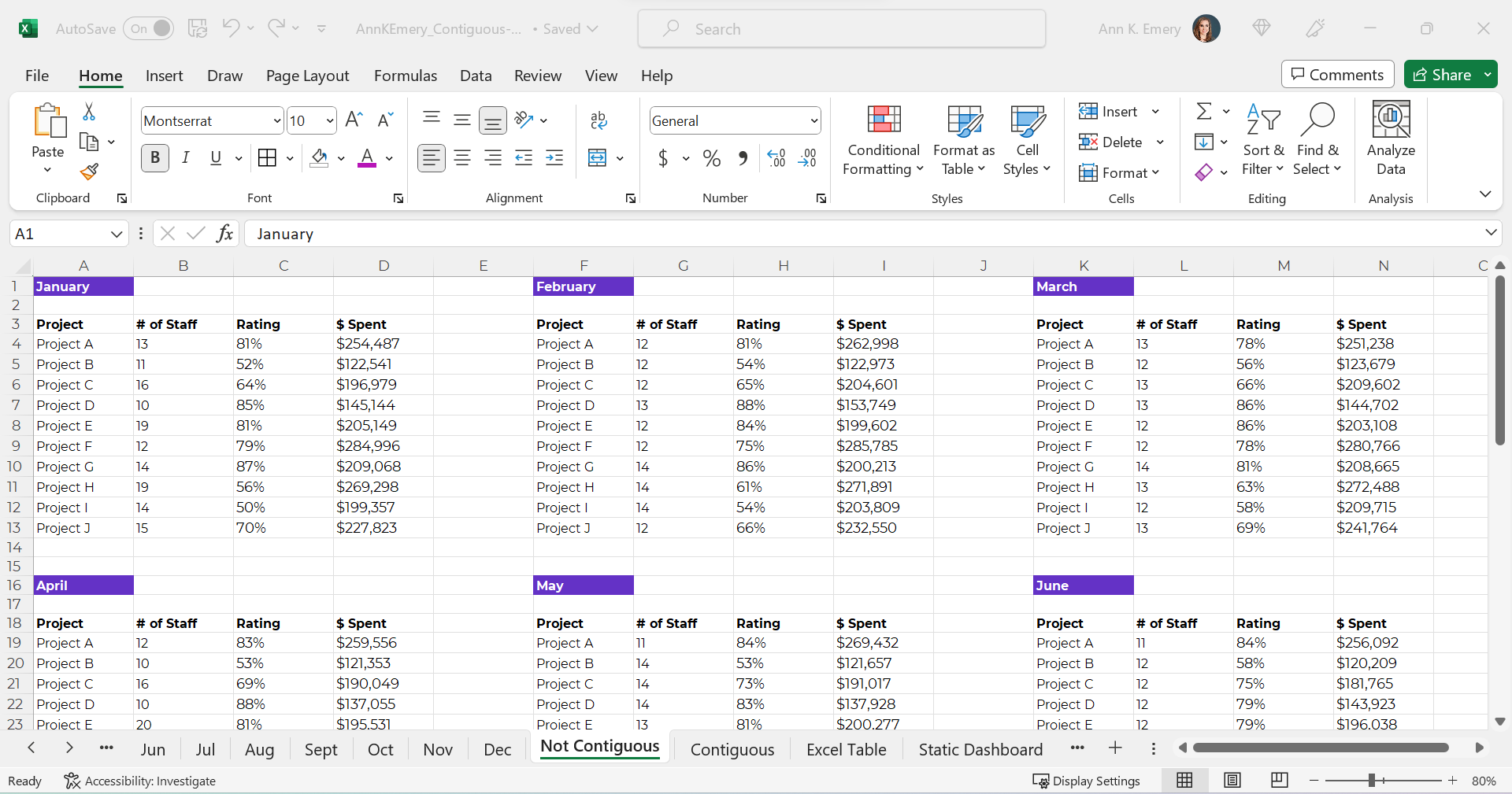
Sometimes there are dozens of mini tables, like this:
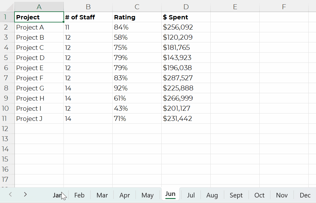
Or, just as terrible for graphs and dashboards — one mini dataset per sheet, like this.
NOOOOOO!!!!!!!!!!!!!!!!!!!!!!
Or, separate mini datasets spread across different Excel files altogether.
NOOOOOOOOO!!!!!!!!!!!!!!!!!!!!!!!!!!!!!!!!!!!!!!!!!!!!!!!!!!!
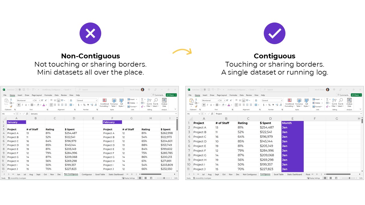
Separate mini datasets (“non-contiguous” or “non-touching” datasets) mean that we can only look at one time period at a time.
We have to make a bunch of mini charts.
It takes forever to make these the first time, and they’re a huge pain to update over time.
It’s also tougher for our viewers to find patterns because the numbers are scattered across too many charts.
NOOOOOO!!!!!!!!!!!!!!!

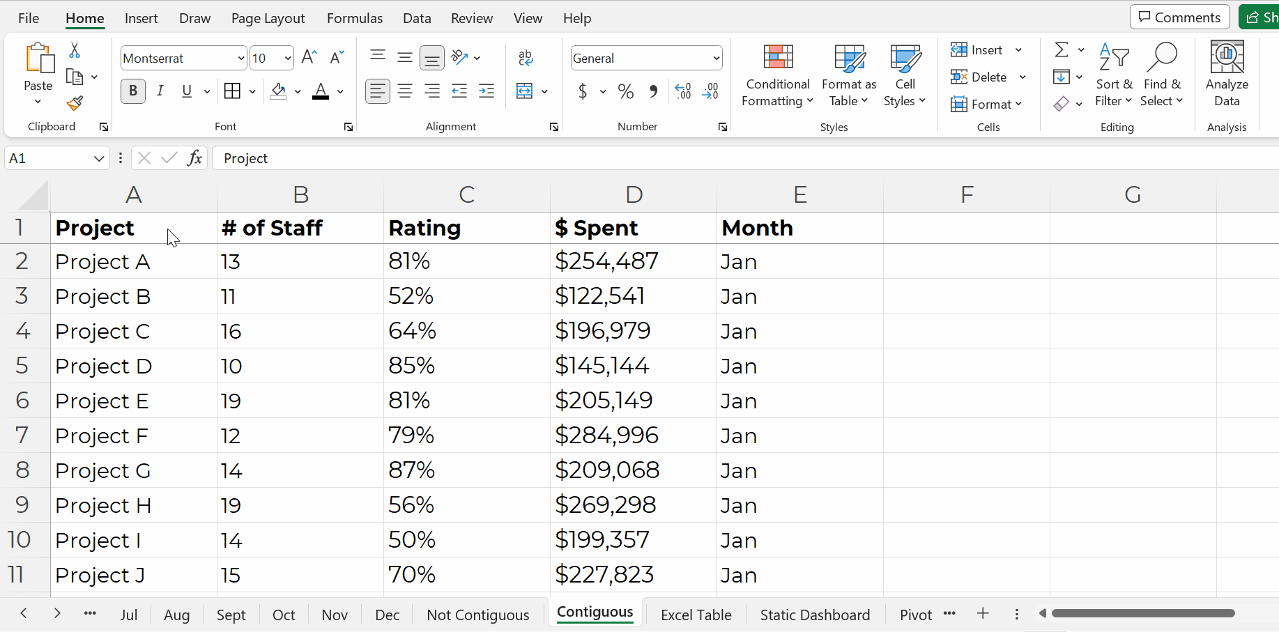
Instead, the numbers should be stored in a single dataset, with the timeframe as its own column, like this:

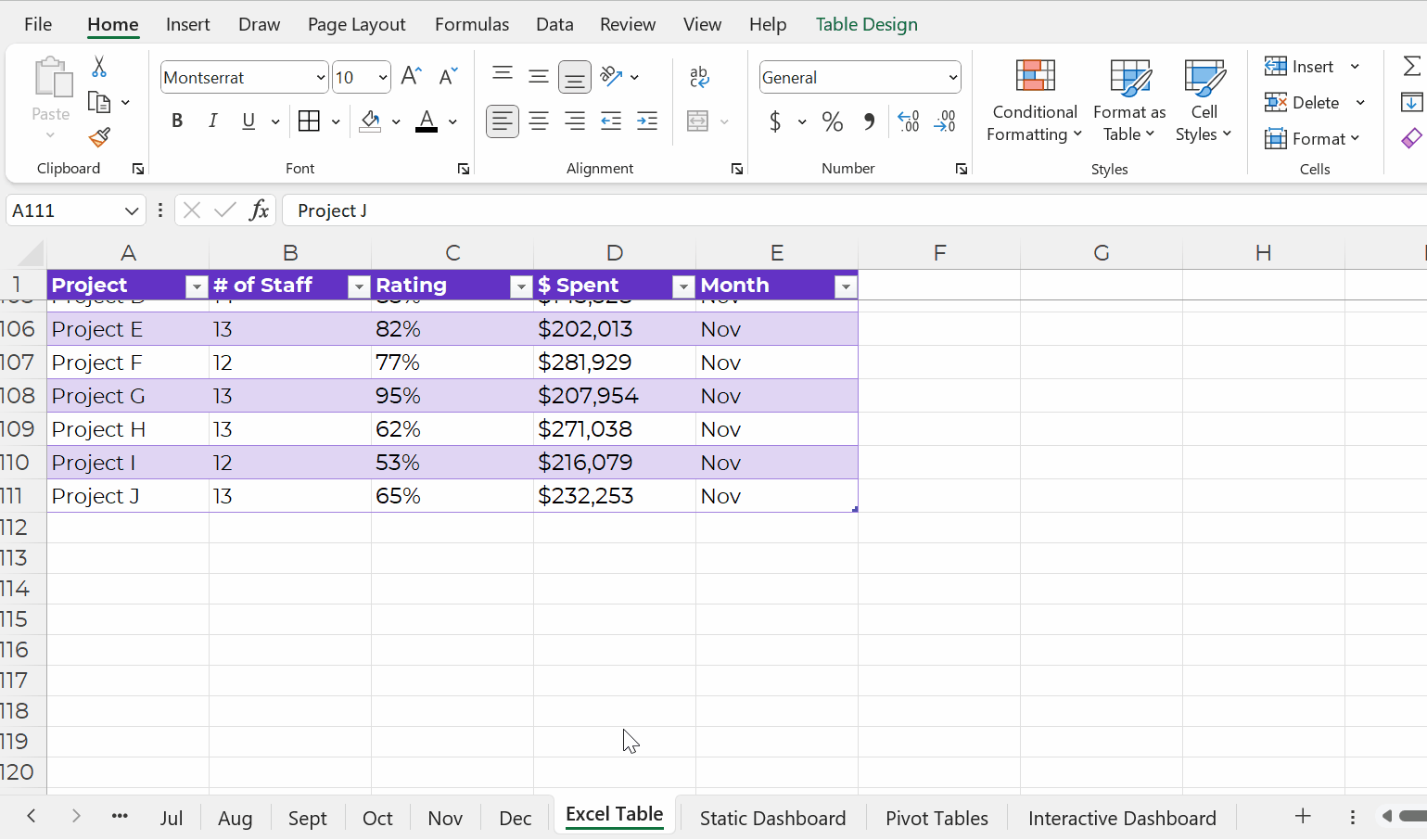
This running list of new entries — a log — is going to get very long.
In real-life projects, the logs might have hundreds of thousands of entries.
That’s okay!!!!!!!!!!!!!!!!! That’s preferred!!!!!!!!!!!!!!!!!!!!
It’s counterintuitive, but contiguous logs make dataviz faster, not slower.
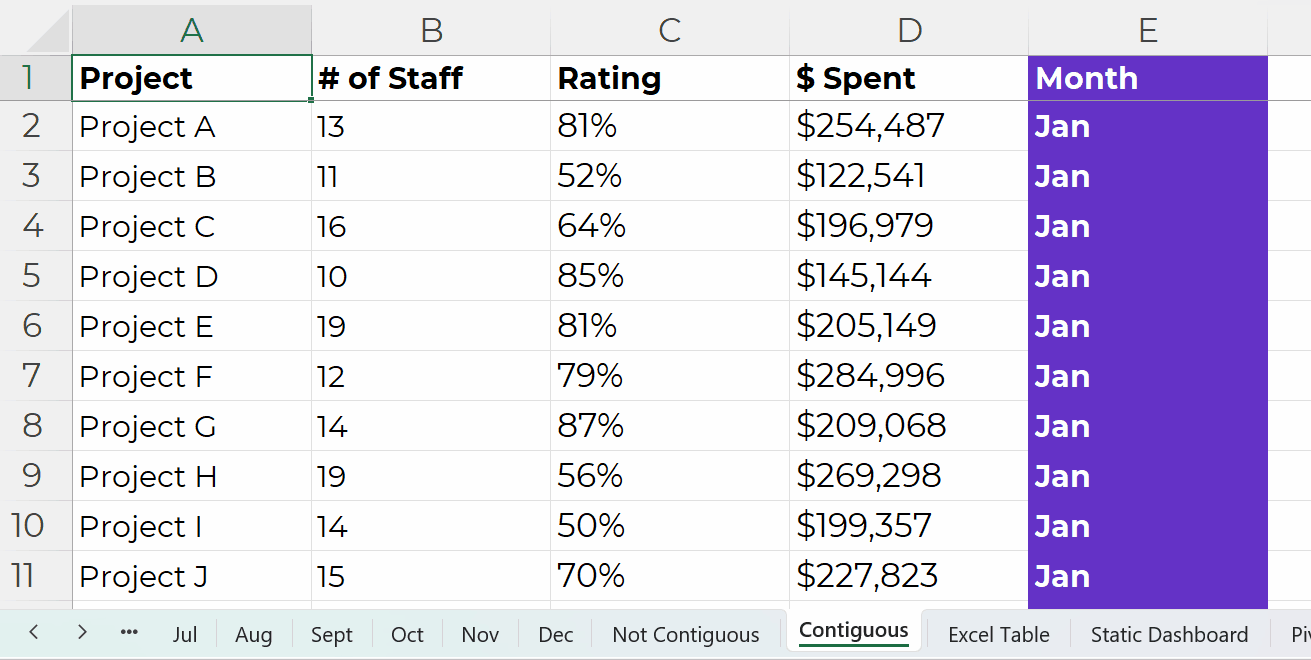
Excel can handle millions of entries.
The length of a dataset won’t make your analysis or visualization take any longer. Repeat after me: Contiguous logs make dataviz faster, not slower.
However…
The width — the number of columns — can certainly take a while, because there are so many different variables to consider.
A table is the generic term for a collection of rows and columns.
An Excel Table is a special feature that makes it faster and easier to update our log.
In other words, Excel Tables make it easier to append our contiguous logs as we get new data.
How to Turn tables into Excel Tables
You’ll simply click on your contiguous log — your generic table.
Then, go to the Insert tab.
Choose a Table.
Click OK.
You’ll recognize the banded rows.
Adding New Entries to Excel Tables
Adding new entries — or appending — is easy.
Let’s pretend you’re downloading data from your organization’s database. You might only be able to download one month at a time into its own sheet. That’s okay!
We’ll simply copy and paste those new entries into our running log.
Then, we’ll add the timeframe to that right-most column, too.
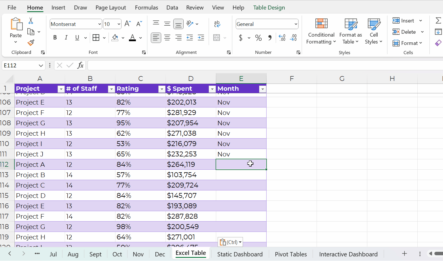
Excel is smart, and it’ll know that your new entries are part of your new dataset. In other words, your new entries will feed into pivot tables and formulas seamlessly.
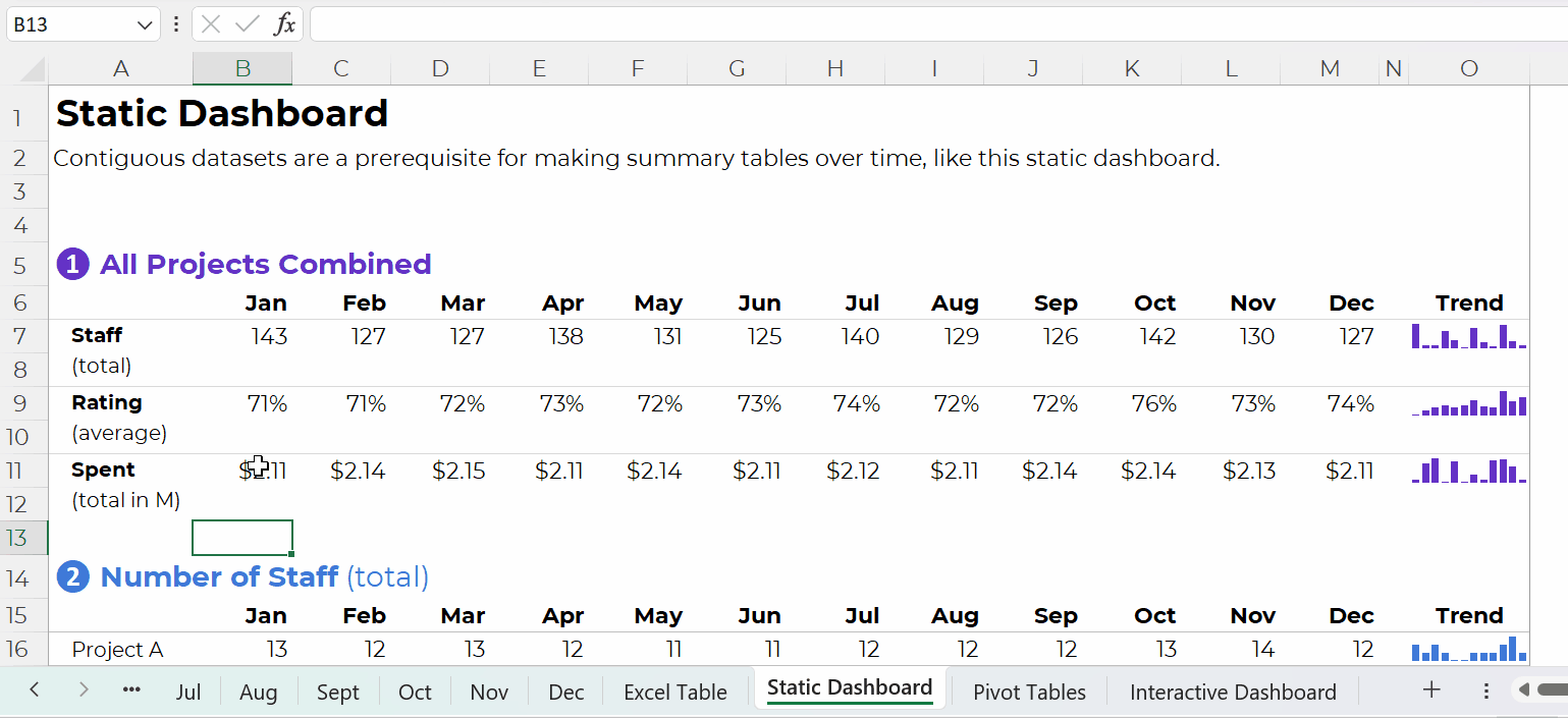
Contiguous Datasets are Required for Static Dashboards
Want a short handout, PDF, or email attachment to share with others?
Maybe you’d want to see how all the projects combined are doing.
Or, maybe you’d want a breakdown of the different projects.
You could even add quick vizzes like sparklines to see trends, like this:
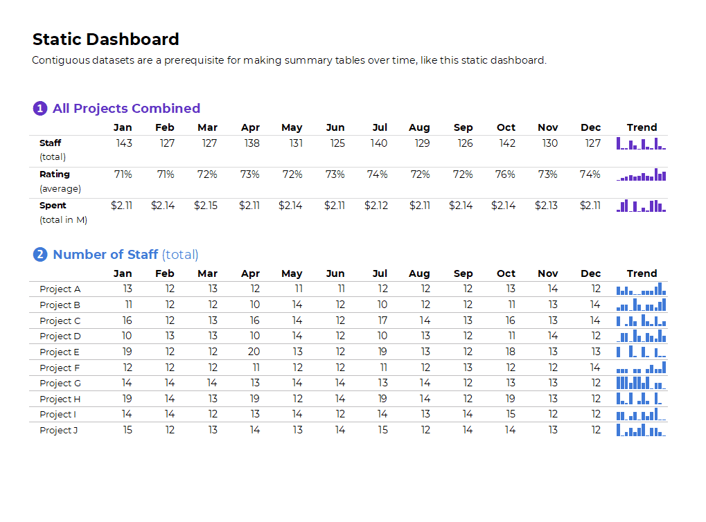
Contiguous datasets are required in order to make static dashboards.
Otherwise the sumifs, countifs, and averageifs behind the scenes will be impossible. Or, the formulas will be painfully slow to set up.
Static dashboards should take less than an hour to design from start to finish.
If it’s taking longer than that, it’s probably because (a) you don’t have a contiguous dataset or (b) you need more practice with formulas.
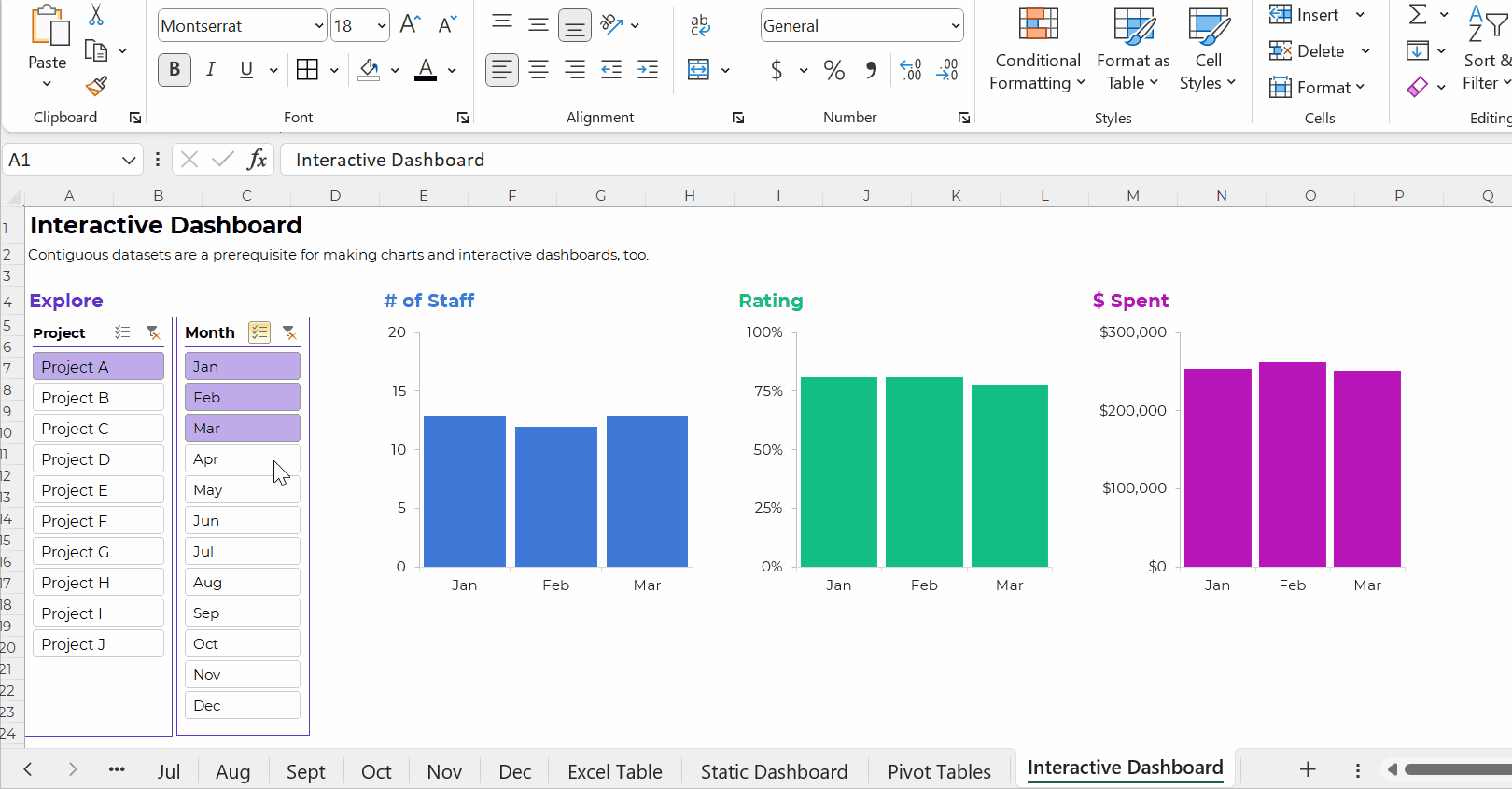
Want to make interactive dashboards in Excel?
Your technical coworkers will love exploring the insights for themselves.
Interactive dashboards involve four pieces:
- A single contiguous dataset stored as a regular ol’ table or an Excel Table. You already know I prefer Excel Tables for datasets that are going to be added to or appended in the future.
- Pivot tables to tabulate the numbers (and bypass formulas, which can be tricky for novices).
- Pivot charts to, you know, visualize the numbers.
- Slicers (a fancy name for the filters).
Once again, contiguous datasets are the foundation of data visualization.
Contiguous datasets are required for:
- Making a single graph to show comparisons over time (not January, February, and March in separate graphs that take three times as long to create and update);
- Making static dashboards with formulas and trendlines that’ll update (nearly) automatically as you add new entries to your log; and
- Making interactive dashboards with charts that’ll update (nearly) automatically as you add new entries to your log.
If your data visualization is taking too long… it’s usually a data management problem.
And it can be easily fixed!!!
Start storing your non-contiguous data as contiguous data.
Ann K. Emery is a sought-after speaker who is determined to get your data out of spreadsheets and into stakeholders’ hands. Each year, she leads more than 100 workshops, webinars, and keynotes for thousands of people around the globe. Her design consultancy also overhauls graphs, publications, and slideshows with the goal of making technical information easier to understand for non-technical audiences.


