
I recently worked with a healthcare system to visualize their multi-year patterns.
Are you lucky enough to have historical data at your fingertips?! Woohoo! What a treat.
Let’s weigh the pros and cons of a few different viz options.
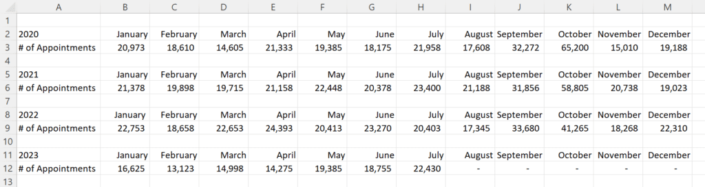
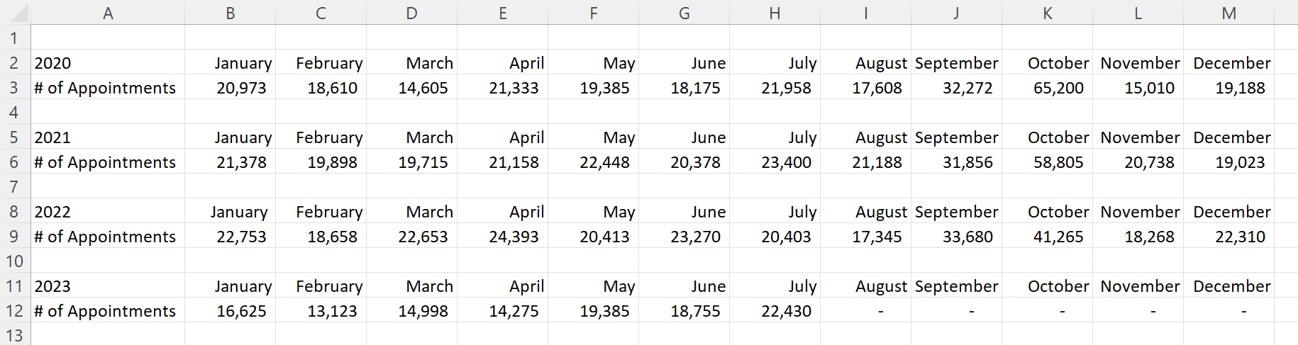
Here’s what their tabulated data looked like, sort of.
Let’s pretend we’re looking at the number of doctor’s appointments that took place within their healthcare system.
That’s not the real variable, and these aren’t their real numbers, but you get the idea: They wanted to visualize patterns over the past four years.
Here’s what their initial visualization looked like: a separate graph for each year.

First, let’s tackle the Quick Wins, a.k.a. the Bare Minimum edits for branding and “Big A” Accessibility:
- Brand colors and fonts
- Darker font for better color contrast
- Sized for a slide (size 18-point font, 13 inches wide, 5 inches tall)
- Arranged left to right, rather than a grid
- “Grouped” all the graphs together for easier copying and pasting into a slide
- Horizontal text only
- Consistent scales to make comparisons across graphs easier
- Fewer demarcations on the y-axis (one label every 25,000 units)
- Changed the y-axis to a “number” format so that a zero appears at the bottom, not just a dash
- Then, only showing the left-most y-axis
- Wider columns, a.k.a. a smaller gap width
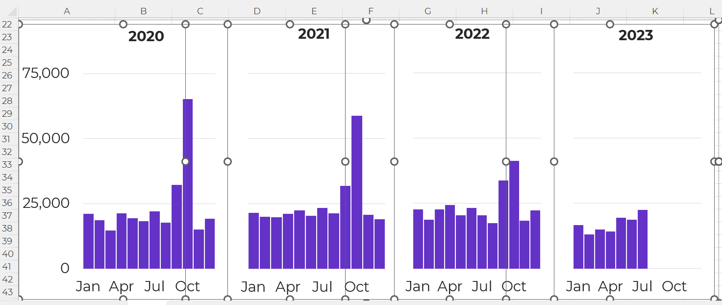
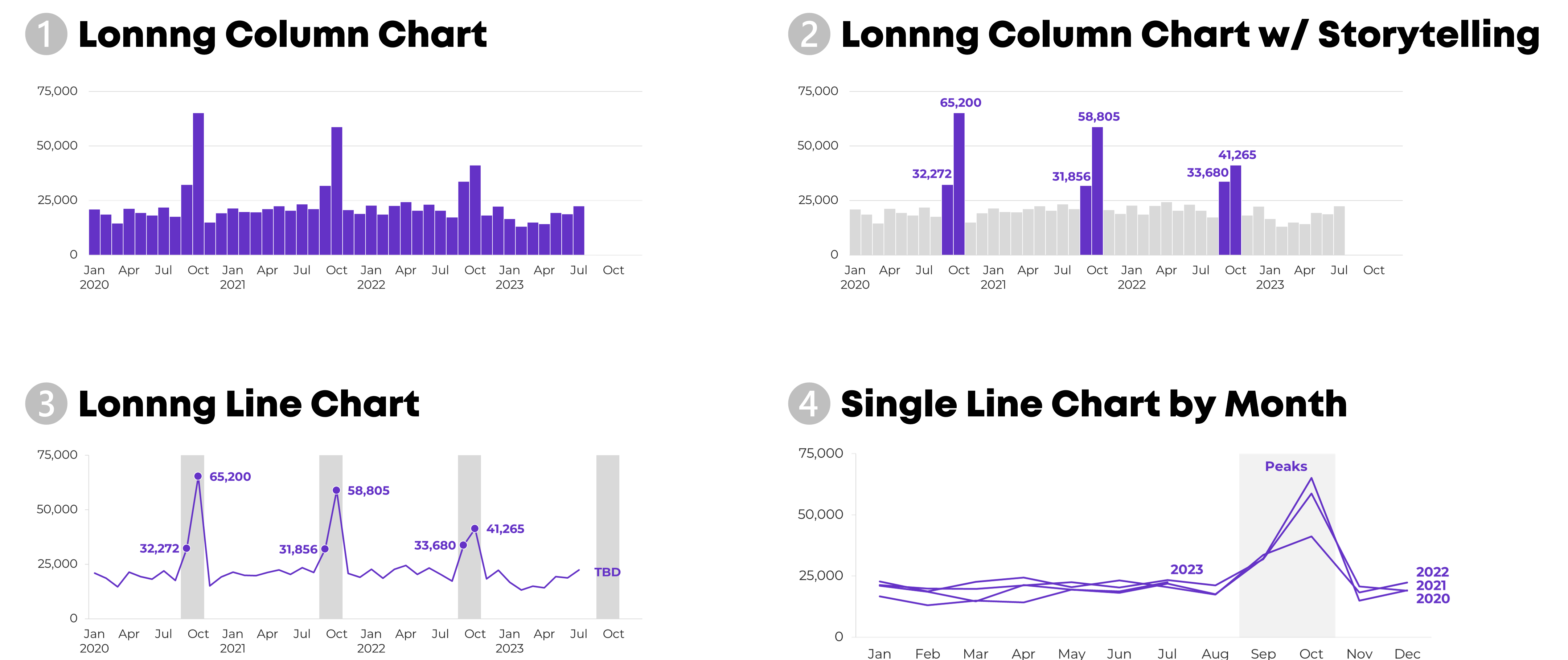
It felt inefficient to keep four separate graphs — too much extra work to align everything and then group everything — so I turned this into a single column chart.
Yep, I had to rearrange the four tables into one table in order to transform the four graphs into one graph. At the bottom of this blog post, you’ll see a link to download my Excel file so you can explore the behind-the-scenes tables and graphs for yourself.

I’ve written about spoken about traditional vs. storytelling graphs a lot over the past decade. If these terms are new, then you can watch the most recent public-facing conference talk here.
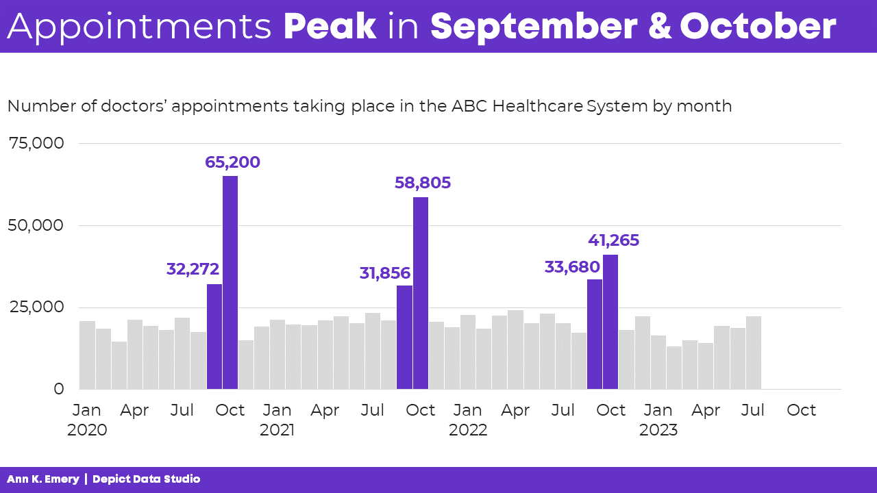
In this version, I intentionally used data storytelling. This data was intended for a busy upper-management office, and leaders often prefer when we cut to the chase, instead of burying them in graphs that don’t say anything.
The presentation slide might look something like this:
- A takeaway slide title
- The topical graph title underneath
- Dark-light contrast
- Labels only one the columns of interest – for September and October
And no, I don’t love how the September labels are right-aligned while the October labels are centered, but this probably isn’t the winning approach, so who cares.
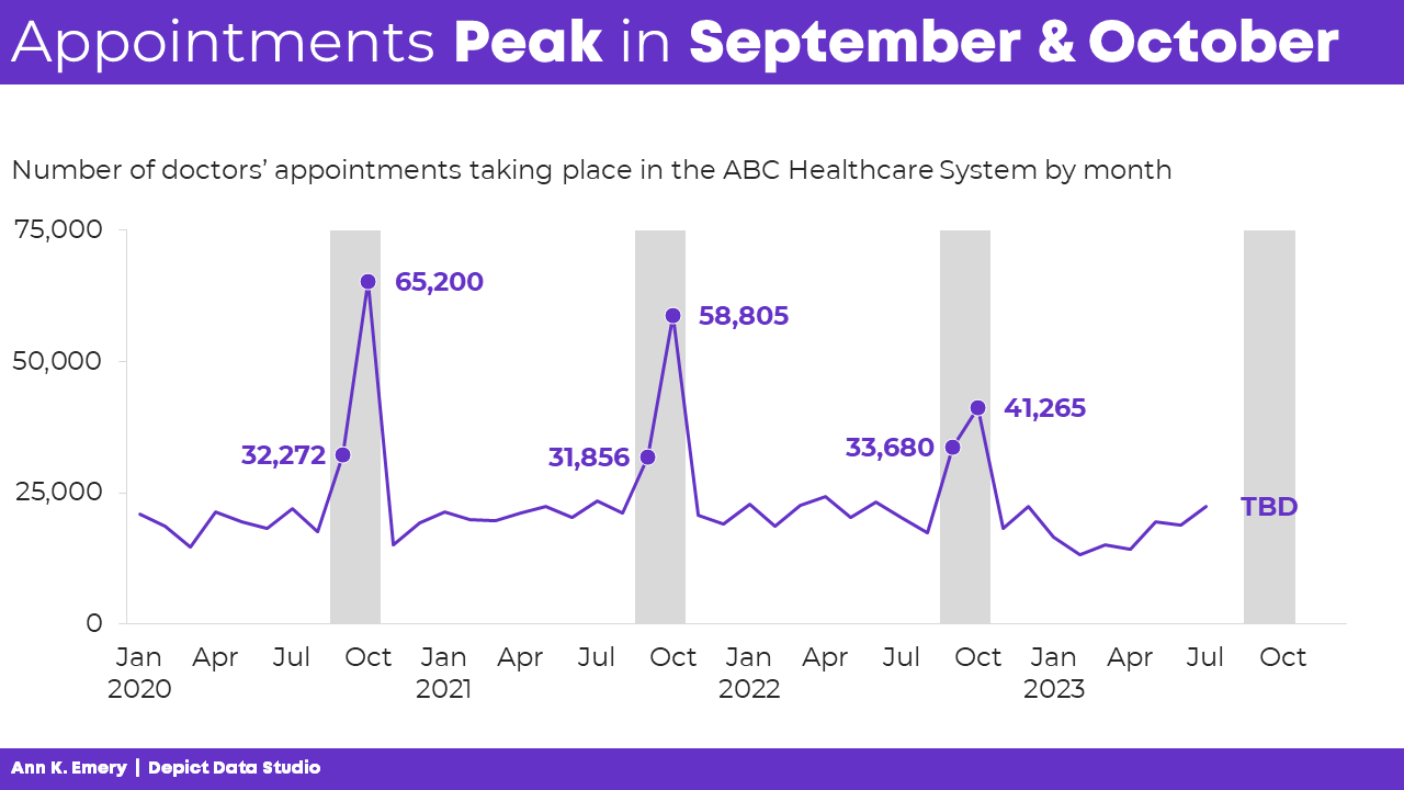
Another option is a line chart with gray shading for the peaks.
Yes, this is a combo chart in Excel.
The presentation slide would look like this:
A final option is a single line chart that stretches from January to December, with each year’s data “stacked.”
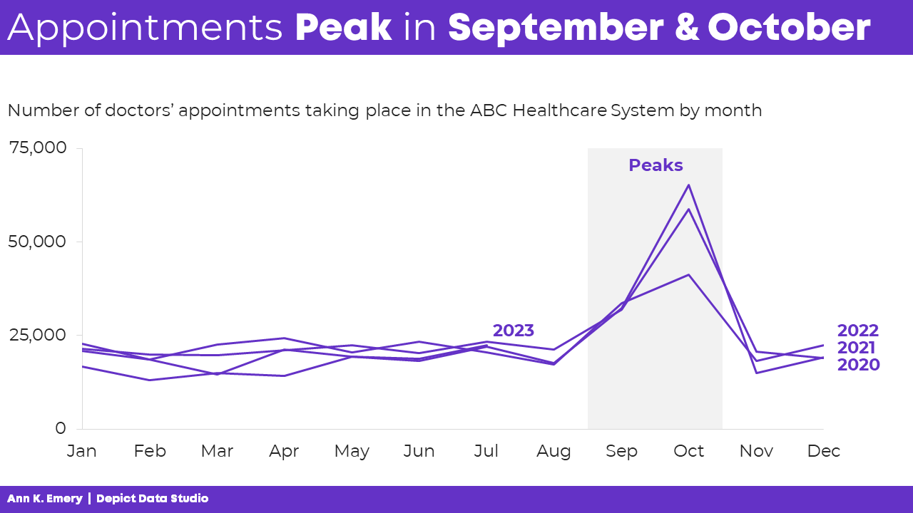
My favorite is Idea 4 because we can easily see the seasonal peaks.
Which one is your favorite, and why? Comment below.
This isn’t an exhaustive list.
Can you think of additional options? Comment below.
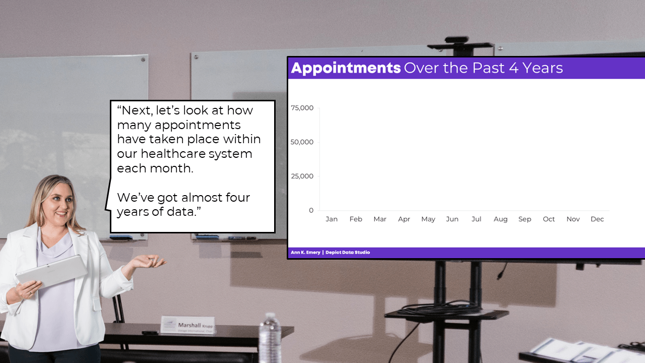
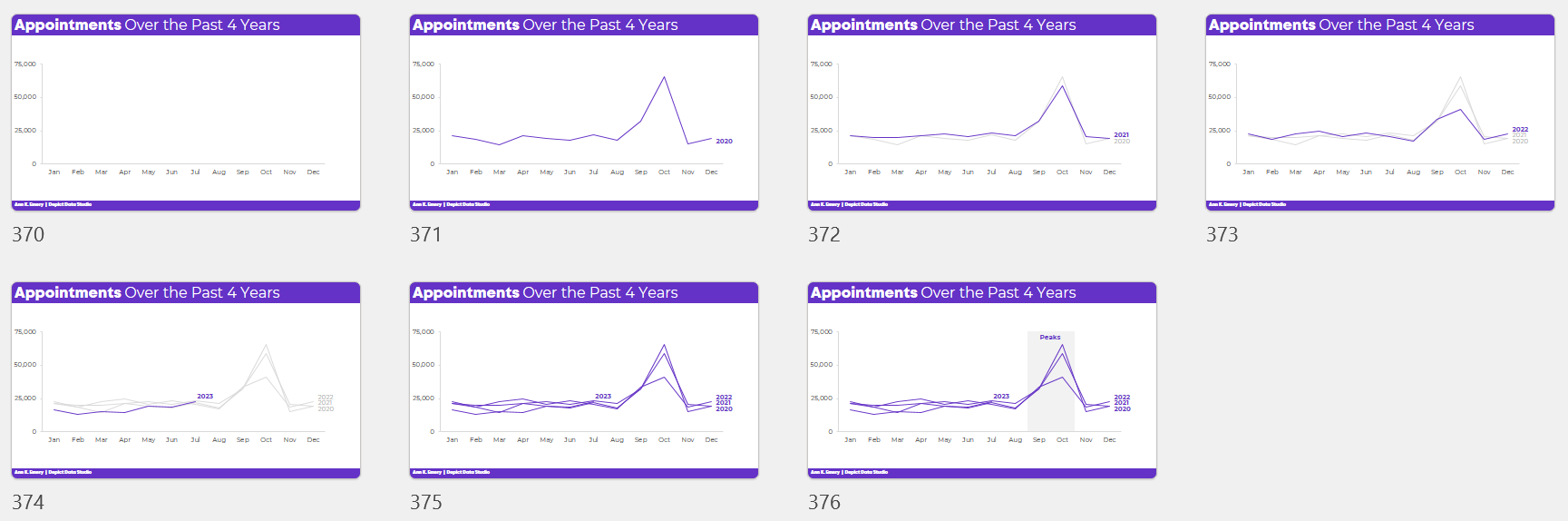
Idea 4 is a sort-of dense graph — and it’s definitely a spaghetti line graph, so we’ve gotta continue adjusting it.
We’ll want to present it piecemeal to match our speaking points.
Otherwise, our audience will die of boredom.
Our bosses will wonder why they hired us.
And nobody will be able to make data-driven decisions based on the data… because while we’re explaining one piece, they’re looking at something else (the very definition of Death by PowerPoint).
The meeting might sound something like this:
I hope you enjoy my kindergarten photoshopping skills. 🙂
PowerPoint’s animation works fine for bullet points.
But, to “animate” graphs to match our voice, it’s usually easiest to create a bunch of different slides.
Want to explore how I made each graph?
You can download my spreadsheet here.
Ann K. Emery is a sought-after speaker who is determined to get your data out of spreadsheets and into stakeholders’ hands. Each year, she leads more than 100 workshops, webinars, and keynotes for thousands of people around the globe. Her design consultancy also overhauls graphs, publications, and slideshows with the goal of making technical information easier to understand for non-technical audiences.


