
Something wonderful — and terrible — has started happening.
Researchers, evaluators, and scientists complete my online courses. Or they bring me in for private workshops.
And they start applying what they learned. GREAT!!!
But it’s a little off. OOPS.
This is entirely my fault. I’ve been recommending that we use icons for years now — but I haven’t been clear enough about how to use them, and how not to use them.
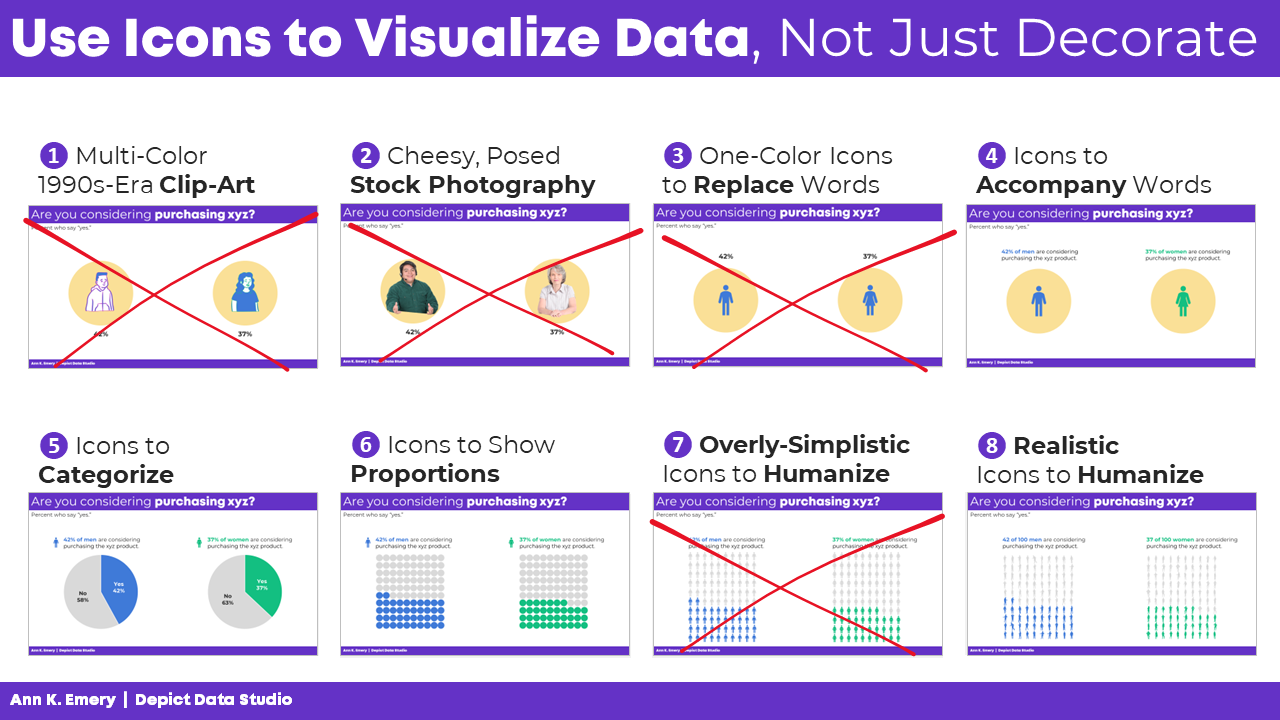
In this blog post, you’ll see 8 different types of icon use. The good, bad, and ugly.
Let’s start with what not to do: clip-art.
Icons and clip-art are similar, but not identical.
Icons use one color, so they hold up well in grayscale printing, or when very small.
Clip-art uses several colors, so it doesn’t hold up well in grayscale printing, and it’s hard to see when it’s small.
For these obvious reasons — clip-art is outdated and hard to see — clip-art gets The Big Red X.
Gosh, I hope this one’s obvious.
I love adding photographs to reports, slideshows, and infographics.
But not the cheesy, posed type, like this.
Another Big Red X.
One-color icons are okay.
But icons can only accompany words, not replace words.
Let’s start by adding words: males and females.
Then, we’ll turn those choppy phrases into full sentences to remove guesswork.
We’ll bold a few key words to make it more skimmable.
We’ll color-code the keywords to match the icons (blue keywords for blue icons).
Finally, we’ll color-code by category: blue for one group, and green for another. You’d obviously use your brand colors, not mine, but the technique is the same: one hue per category.
Even if you’re the slowest typer in the world, these bare-minimum edits should only take a minute.
Next, let’s add some actual, ya know, graphs.
Bar charts are fine, but they’re super boring if that’s all we have.
These are binary variables — a.k.a. yes/no variables — so two-slice pies are perfectly fine.
(Here’s my list of pie chart guidelines if you’re not familiar with my stance on pies.)
This is where we can add icons to categorize.
You see the difference, right?
I’m not a fan of using icons on their own, like the previous examples. They feel overly-simplistic and dumbed-down. But I am a fan of using icons to accompany other graphs, and to aid with categorization, like this:
We’re not limited to pies for binary variables.
We could use pies, donuts, or square pies.
No matter the graph type, the icon usage is the same: They’re accompanying the graphs, and aid with categorization.
We can also use icons as the visualization itself.
Collages of icons are called icon arrays. The square version is also known as a waffle chart.
For bonus points, we could add the male/female icons to aid with categorization, too.
You see the distinction, right? The primary icons (the collages of squares or circles) are used to visualize the data, not just decorate it.
The only thing worse than one dumbed-down Gingerbread Person is a hundred of them.
NO MORE GINGERBREAD PEOPLE!!!
I am a fan of using realistic icons to humanize the data.
You see the differences, right? We’re not using single icons just to decorate, like the first couple examples. We’re using icons to categorize and/or to show proportions.
And we’re not using dumbed-down Gingerbread People. We’re using realistic human silhouettes.
More Examples of Realistic Icons to Humanize
I want to normalize these realistic icons for you. Here are a couple examples from the wild:
Using Smaller Denominators
All icons — squares, circles, Gingerbread People, and realistic human icons — get tricky to read when they’re tiny.
In some projects, we can simplify our fractions.
I tried changing 42% of men to 42 of 100 men, and then to 21 of 50 men. That worked fine!
But when I tried changing 37% of women to 37 of 100 women, and then to 18.5 of 50 women… yuck. If our unit of analysis is people, we can’t talk about or visualize half a person. That’s confusing to our audiences.
So while I’d prefer to simplify the fraction, I can’t in this specific example.
Traditional and Storytelling Versions
Hopefully you’ve heard me talk about traditional vs. storytelling graphs before. If not, you can watch this video for a quick overview. Both versions are correct, but they’re correct for different types of audiences.
There are several different ways to use icons in data visualization, and some are better than others.
I don’t recommend clip-art (version 1) or cheesy stock photos (version 2).
I don’t recommend icons to replace words (version 3).
I don’t even recommend icons on their own (version 4).
Instead, at a bare minimum, we should be using icons to accompany other graphs and to categorize (version 5).
Better yet, I’d prefer that we use icons (like little squares or circles) to show proportions (version 6).
And when our unit of analysis is humans, I’d prefer that we use realistic human icons (version 8) and never the dumbed-down Gingerbread People (version 7).
Which version of icons are you currently using? Which one might you try in the future? Comment below with all your ideas! Bonus points for sharing links to your public-facing projects so we can learn from each other.
Ann K. Emery is a sought-after speaker who is determined to get your data out of spreadsheets and into stakeholders’ hands. Each year, she leads more than 100 workshops, webinars, and keynotes for thousands of people around the globe. Her design consultancy also overhauls graphs, publications, and slideshows with the goal of making technical information easier to understand for non-technical audiences.


